Logo | Package | Brand Guidelines
KORO Branding

KORO is a Macedonian tea company that’s been present on the market for over a decade. They focus on keeping all of their teas 100% organic, while still keeping the prices affordable for everyone.
CLIENT BRIEF
After discussing their needs and goals, the final conclusion was that they want a fresher, more modern brand image while maintaining some already established elements. This meant a logo and a package redesign, creating a brand identity as well as a brand book with guidelines for the client to use in the future.
DESIGNING THE LOGO
The challenge was clear and simple - redesign the logo into a more modern one, but don’t make it completely unrecognisable from the previous one. The client also requested that I kept their current typeface, as that was the most eye-catching element of the logo, as well as stick to red as the main color.
After three completely different iterations, this is the version that the client decided to proceed with. The left logo is the primary logo, whereas the two on the right are secondary logos.
![]()
![]()
![]()
BRAND GUIDELINES
I intended to first design the logo in order to set the tone for the rest of the brand, meaning that the package design would come last. In the brand guideline below, you can see a simple explanation about the usage of the brand’s logo, typography and colors.
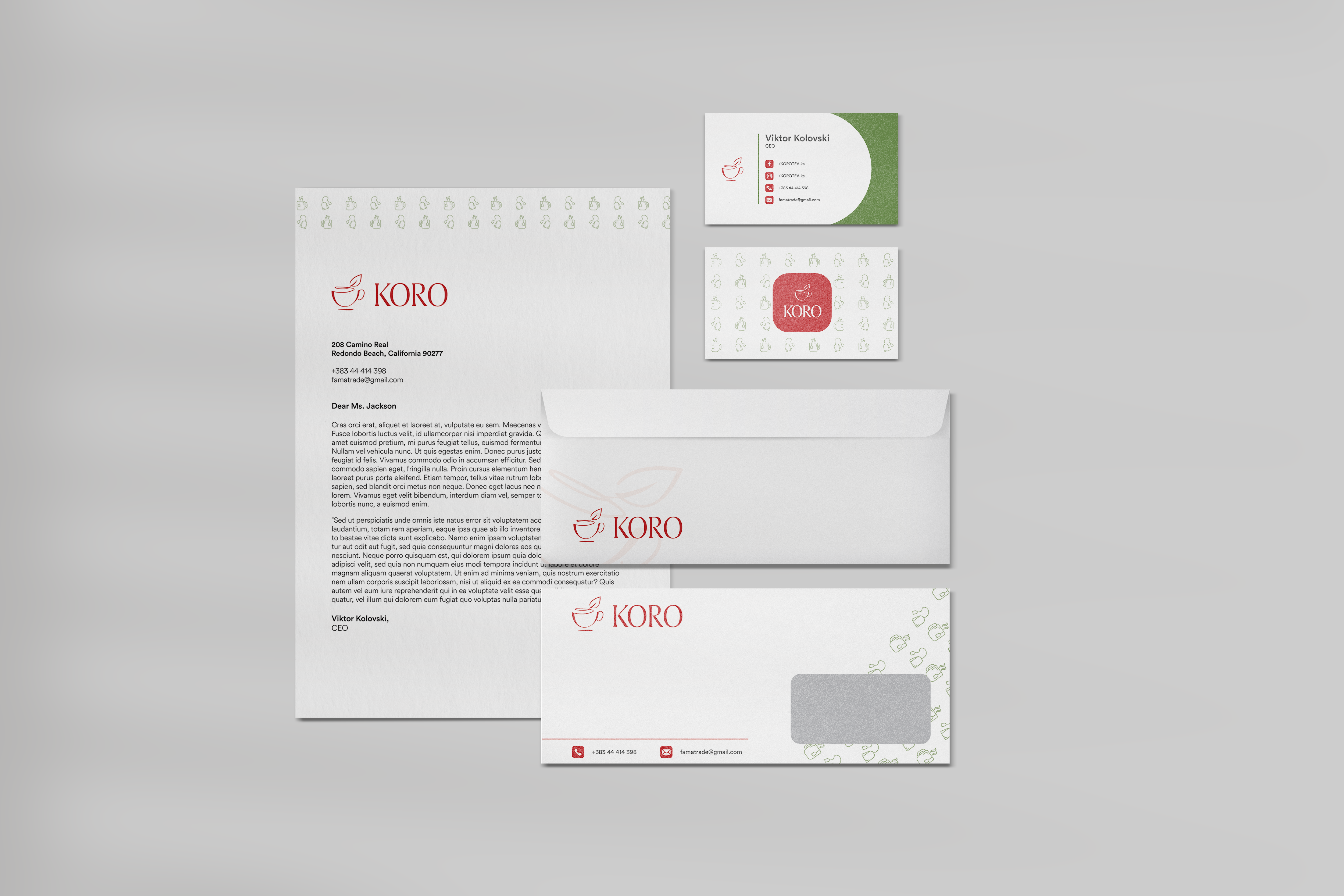
This means that any material designed in the future (social media posts, documents, packaging, business cards) is to be created following these rules. By refering to this guide when creating any design related to the KORO brand (package, business cards, envelopes), the client ends up with a design that perfectly represents KORO.
You can take a look of the brand book below:
STATIONERY
No brand is complete with only a logo, so after establishing proper guidelines to follow, I designed some stationery items for the brand.
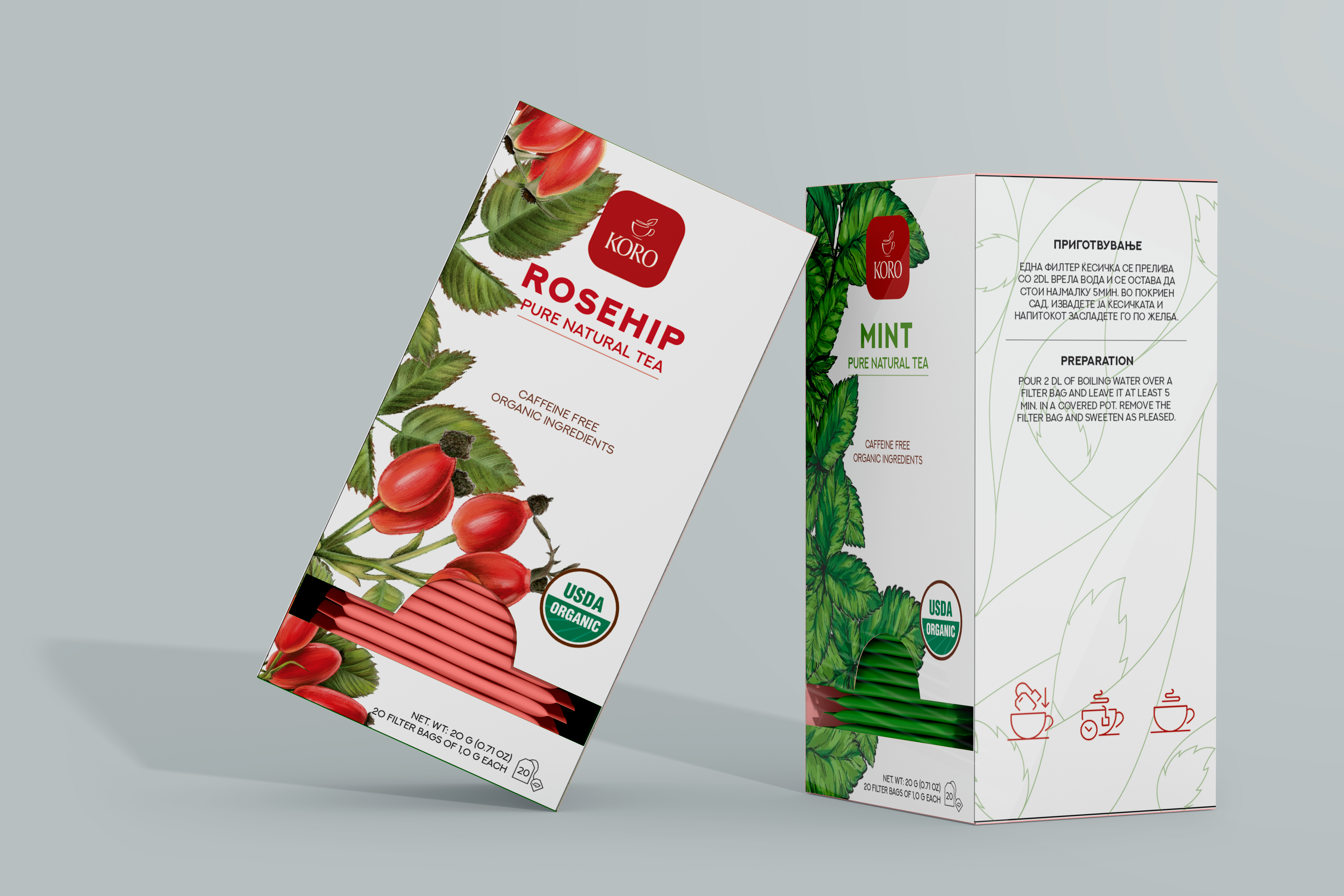
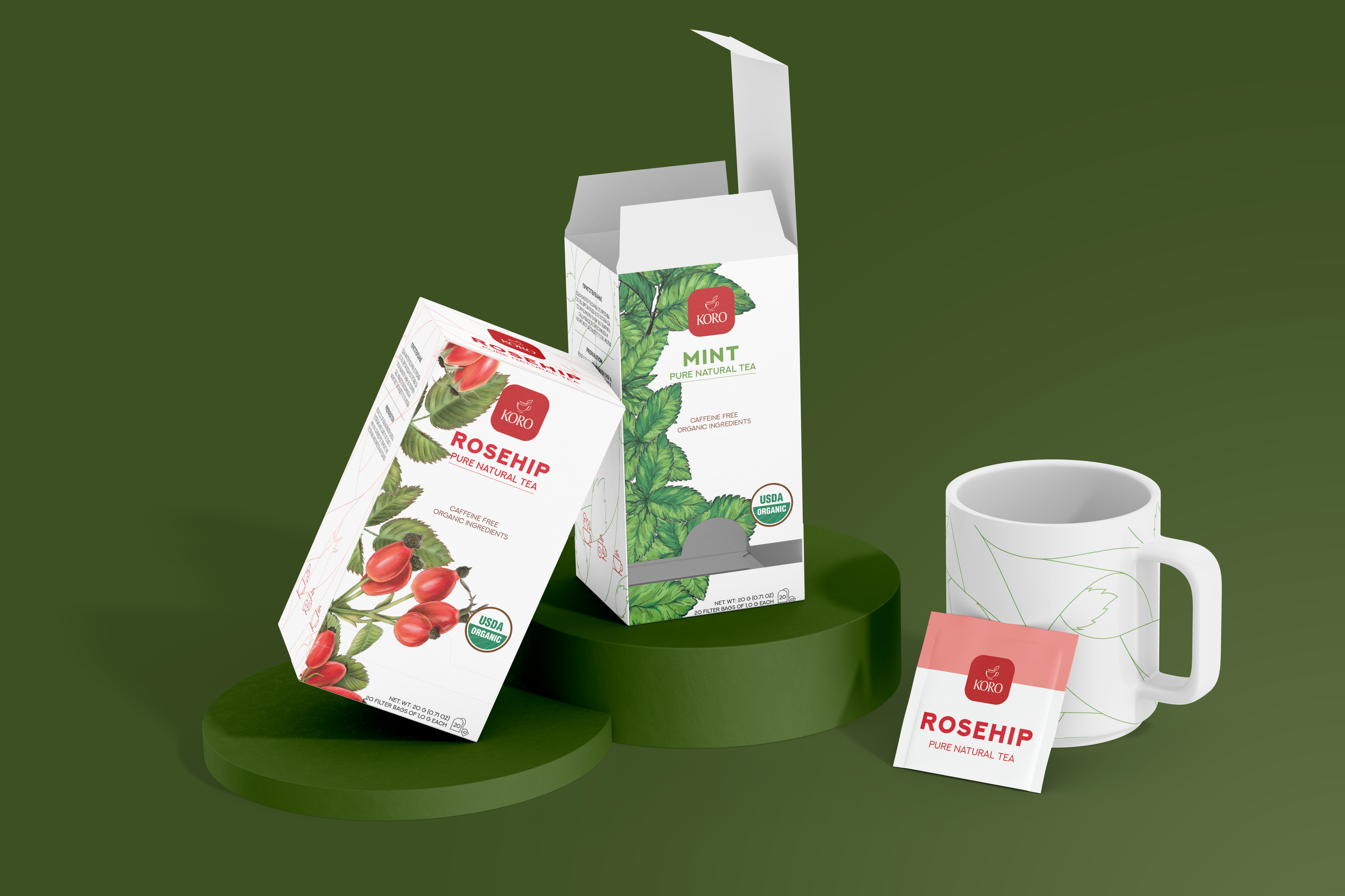
PACKAGE DESIGN
Lastly, I finished off this project by designing a package for each of their teas. Keeping it simple, I added some very high quality illustrations of the herbs on the left side, while also using the main color of the herb to write the name of it.
On the sides, I hid the herbs between the curved lines for a nice aesthetic which would give a slight touch of color and add some dimension.
Thank you for reading through this brand redesign case study, I appreciate it!
Personal Branding
