UI/UX Design
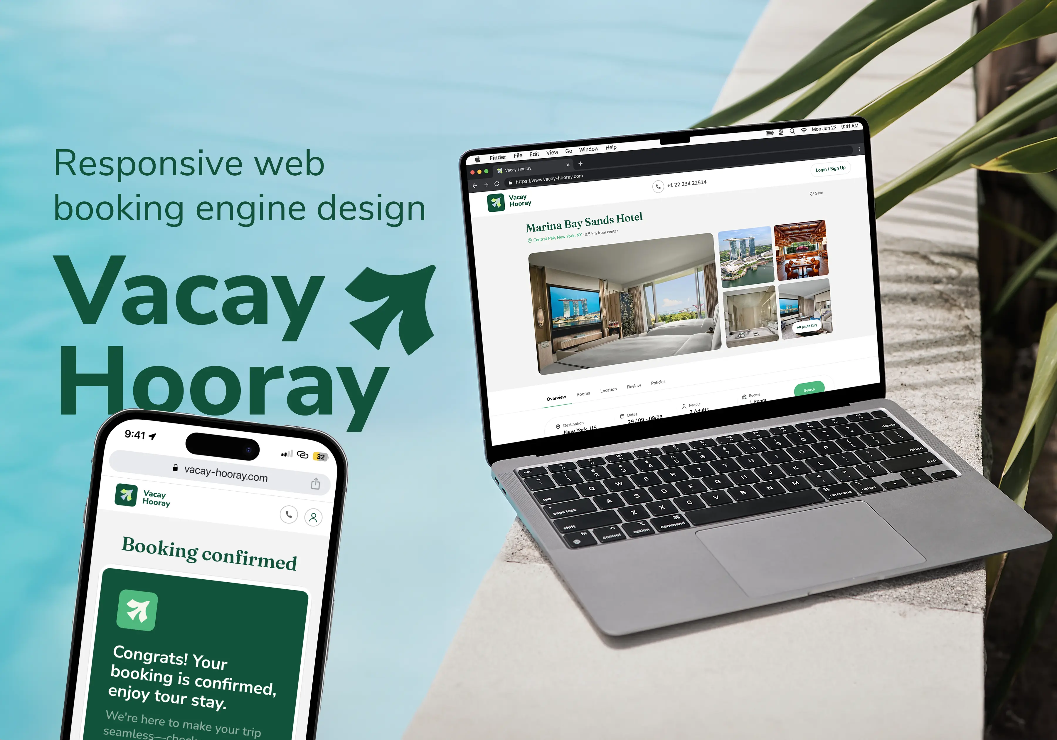
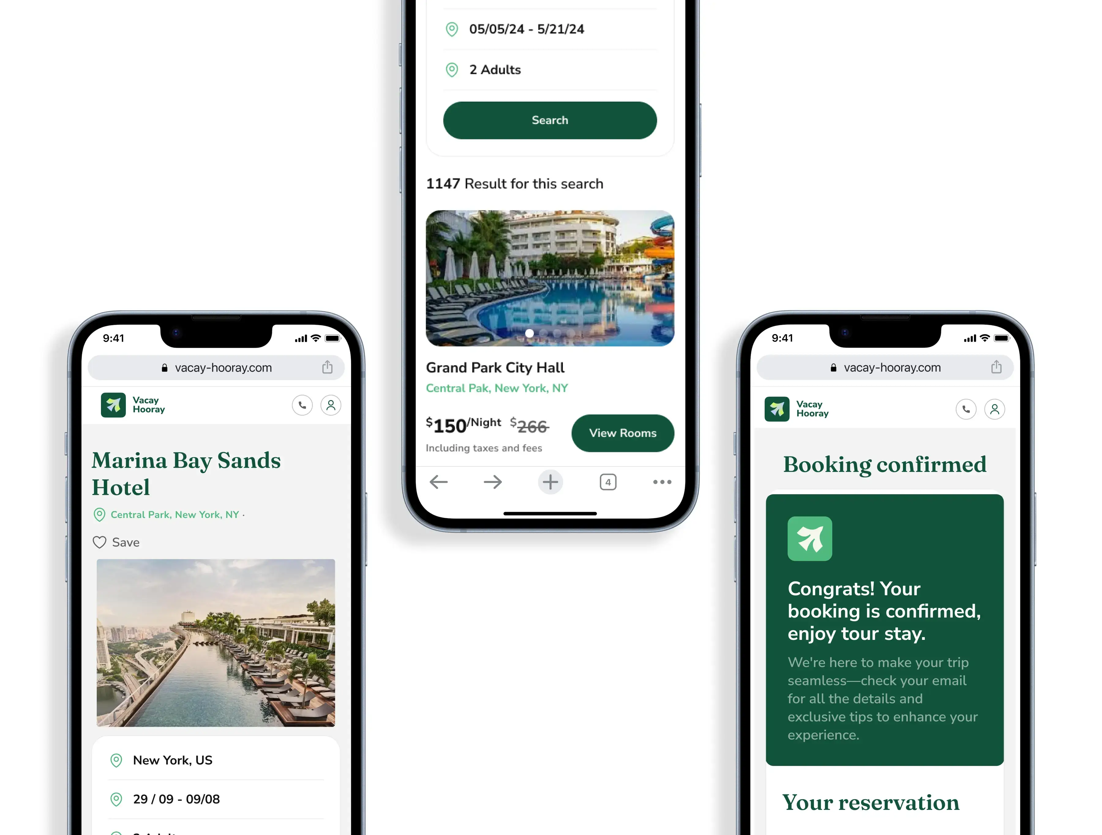
Vacay Hooray - Website Design
ABOUT THE PROJECT
I was presented with a challenge by a client to design two separate booking engines with this goal specifically aiming to offer lower prices for hotels around to world and make accomodation booking easier.
PROBLEM STATEMENT
When booking accommodation on many websites, people often encounter hidden fees, unclear pricing, overwhelming options, and a complicated checkout process, making it difficult to confidently secure the best deal without frustration or uncertainty.
WHY TWO DIFFERENT WEBSITES?
Travelling covers an enormous group of people, so the client wanted to pursue two completely different options that would allow a different group of users to optimize their booking experience.
The goal for Vacay Hooray was a modern, fun approach that would stand out of in the ocean of booking engines that already exist. This business distinguishes itself by negotiating exclusive, unpublished hotel rates daily, and the challenge was to design a booking experience that effectively communicates this value while ensuring a seamless search and reservation process.
RESPONSIBILITIES
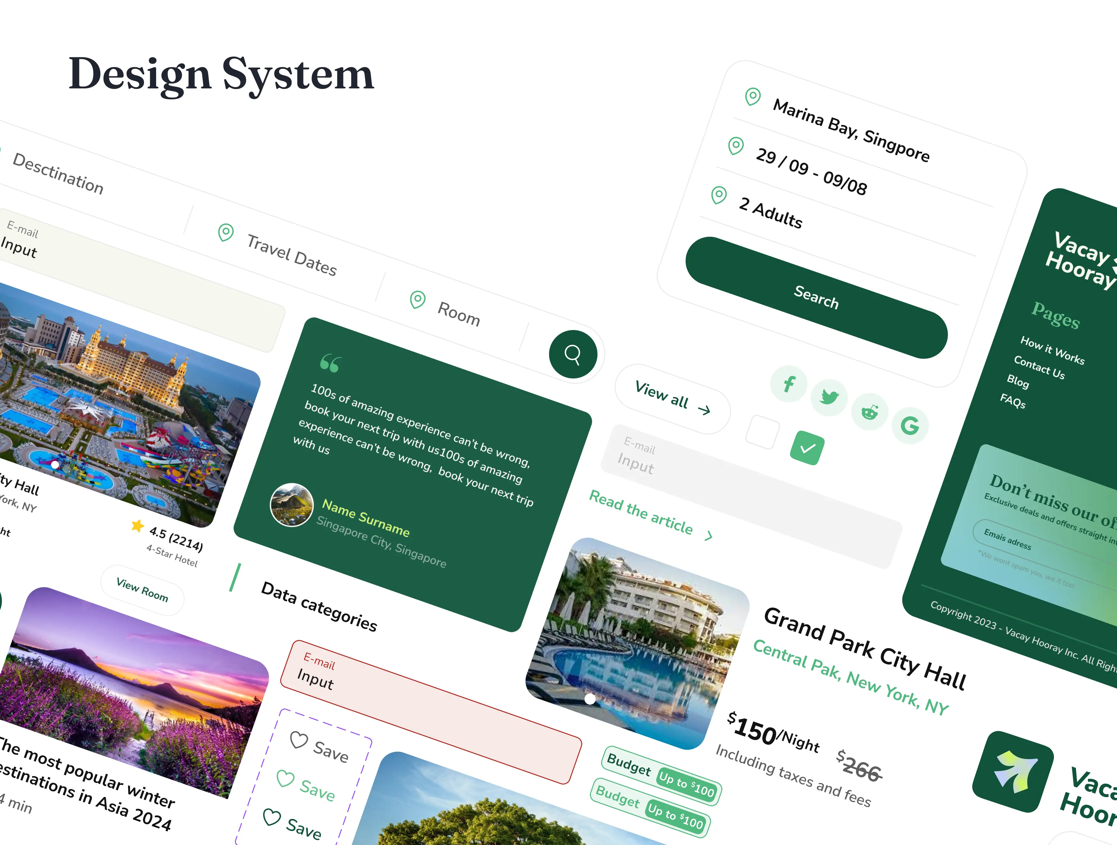
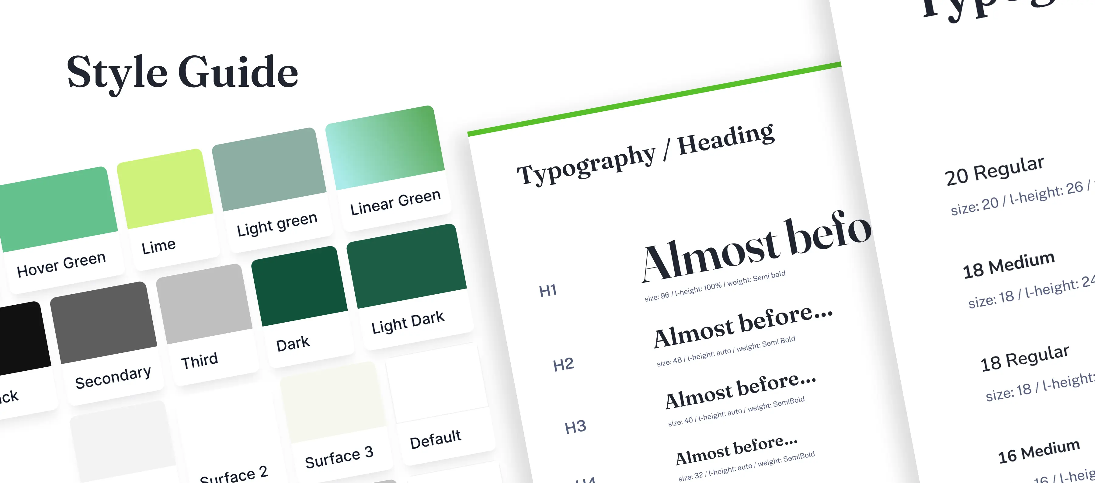
As the UX/UI Designer for this project, my job was to turn the client’s idea into a booking platform that’s both user-friendly and visually appealing. From start to finish, I was deeply involved in the design process, including:
Natura Therapy
